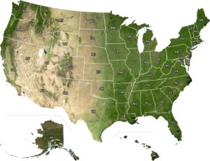
US Mean Annual Heating Degree Days Map
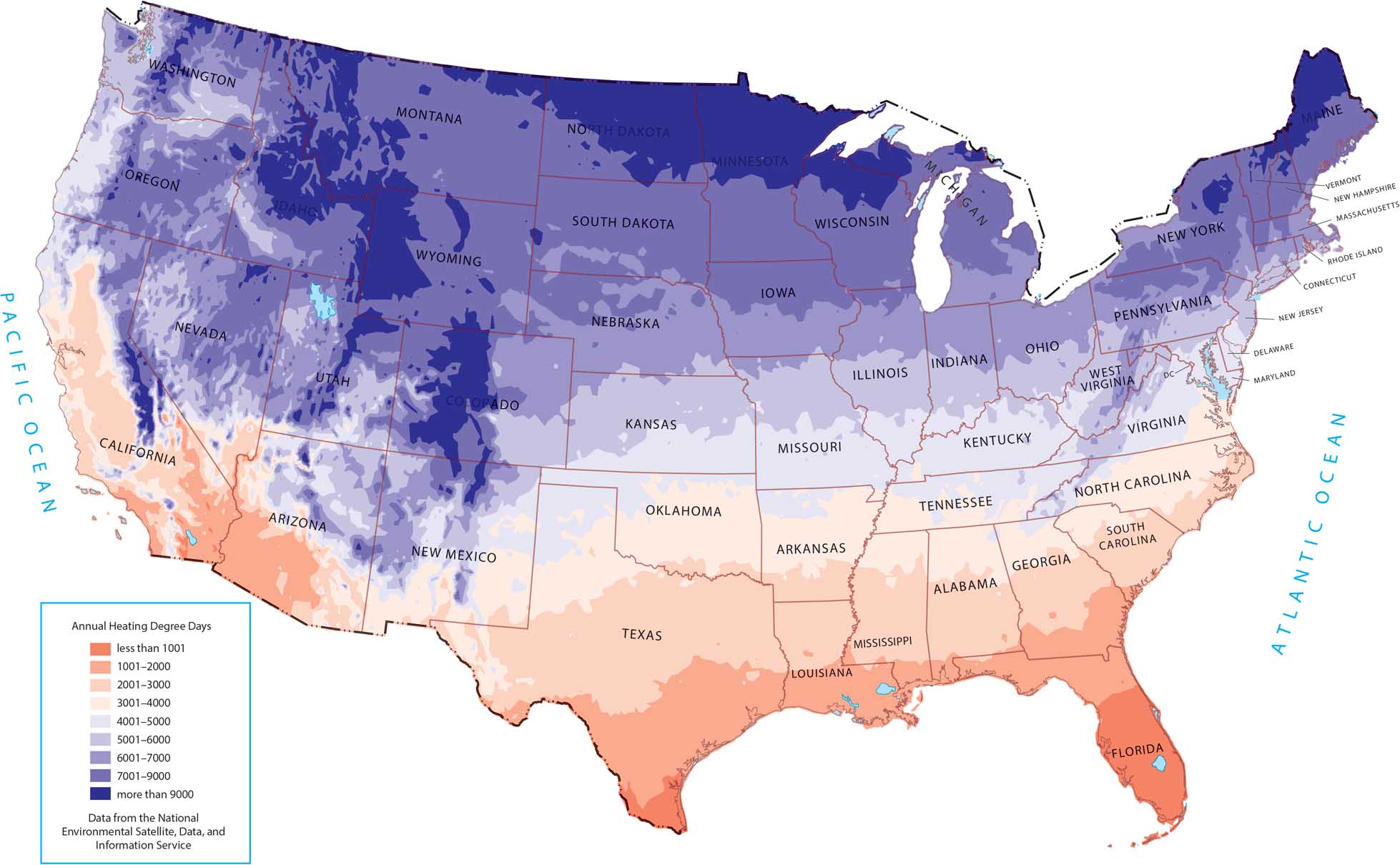
As shown on our map, heating demand increases moving north and into higher elevations. The coldest regions, including the northern Plains and mountain states, stand out the most in purple. The deep South has almost no need for heaters because of its geography.
Map Information
Country Maps
Explore the geography that defines this nation.