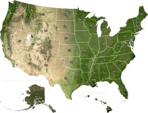
US Mean Annual Daily Maximum Temperature Map
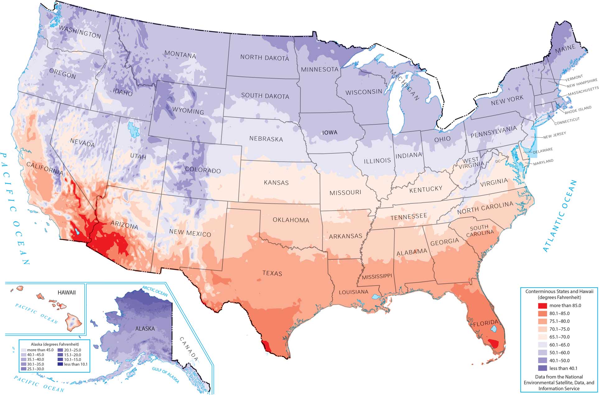
This map shows how maximum temperature varies across the country. The hottest maximum temperatures cluster in the Southwest and southern interior. As you can see, higher elevations and northern states stay cooler. Our map highlights how latitude, elevation, and desert geography drive these patterns.
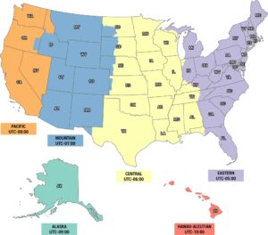
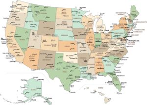
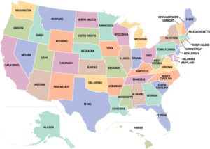
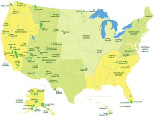
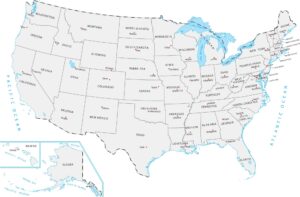
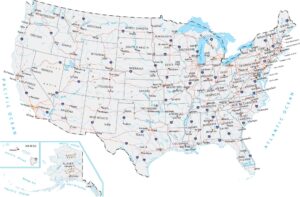
Map Information
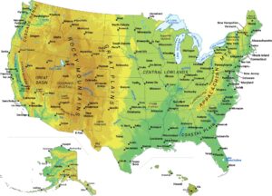
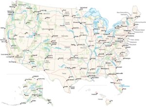
Country Maps
Explore the geography that defines this nation.