US Mean Annual Cooling Degree Days Map
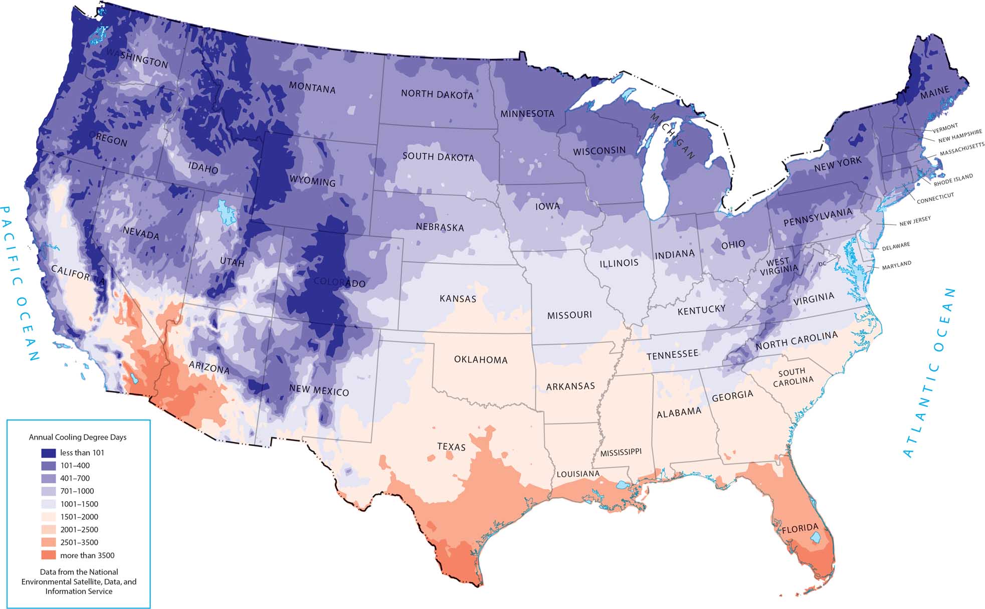
This map highlights where cooling demand is greatest. Southern states and desert regions stand out because they’re driven by high temperatures and long warm seasons. Northern states and mountain regions need minimal cooling since their summers are shorter and milder.
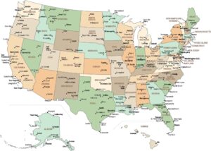
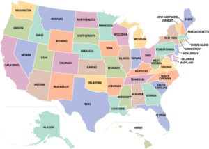
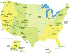
Map Information
Country Maps
Explore the geography that defines this nation.