US Biomes Map
Our US biomes map breaks the landscape into major ecological regions. Boundaries follow patterns of temperature, rainfall, and elevation.
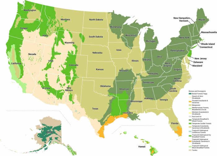
Our US biomes map breaks the landscape into major ecological regions. Boundaries follow patterns of temperature, rainfall, and elevation.
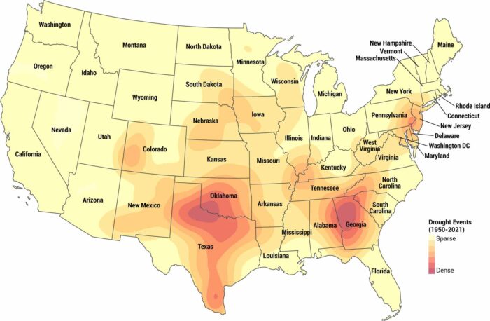
Seventy years of drought data laid out in one place. This map tracks drought conditions across America from 1950 to 2021.
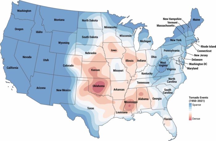
Where do tornadoes hit hardest? Seventy years of tornado data in one map. The darkest spots are Oklahoma, Texas, Mississippi, and Georgia.
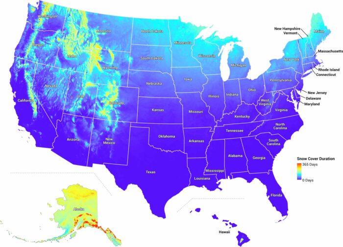
Our map of US snowfall breaks down how many days it stays blanketed in snow. There’s a huge gap between Minnesota and the south.
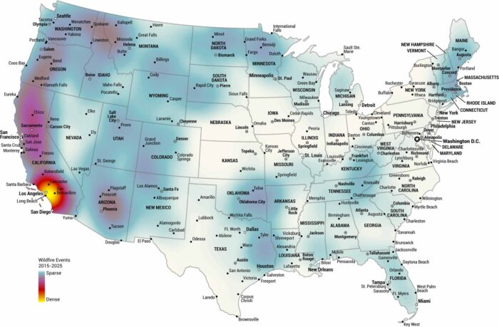
Where have wildfires hit hardest over the past decade? This US wildfire map tracks hotspots from 2015 to 2025, with California most dense.
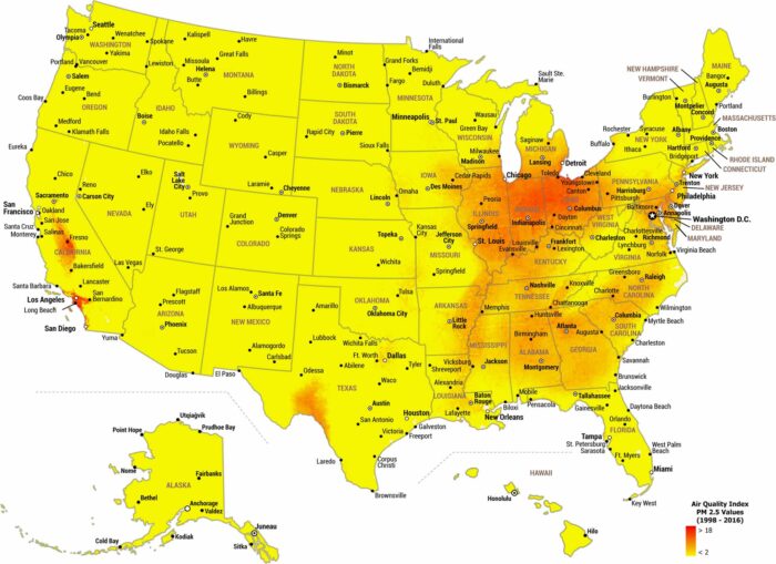
Air quality in the United States varies widely by region. Our map of US air quality shows PM 2.5 concentrations over nearly two decades.
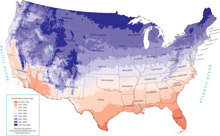
As shown on our map, heating demand increases moving north and into higher elevations. The deep South shows the exact opposite.
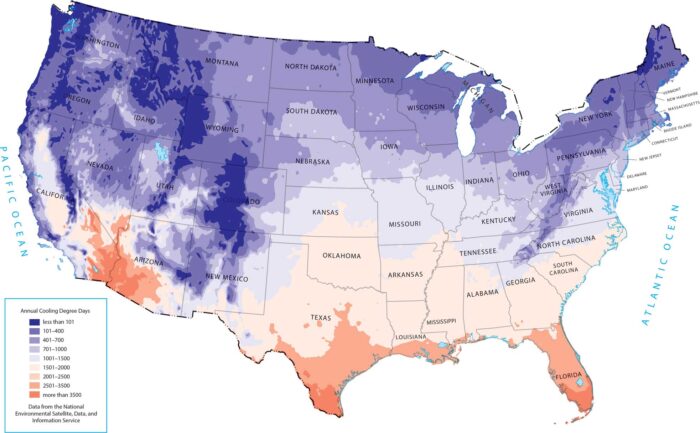
This map highlights where cooling demand is greatest. Southern states and desert regions stand out because of high temperatures.
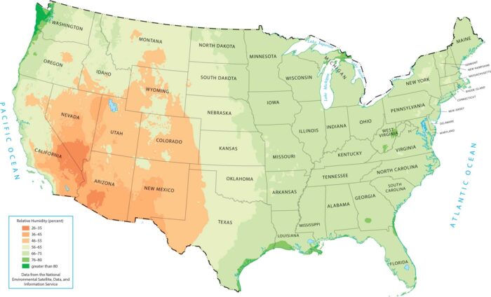
Our map shows how the United States gets progressively more humid as you move from the dry West to the moisture-rich East.
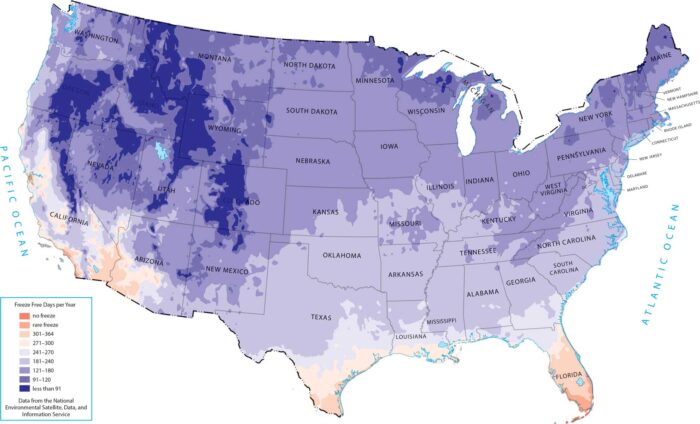
Our map reflects how latitude and ocean control growing seasons. The freeze-free period grows longer as you move south and toward the coasts.
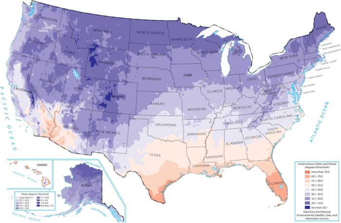
Our minimum temperature map reveals how northern states and high-elevation areas experience the coldest overnight lows throughout the year.
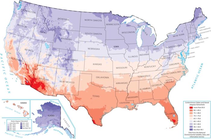
This map shows how maximum temperature varies across the country. It shows how latitude, elevation, and desert geography drive temperature.
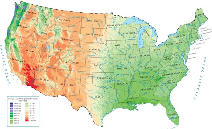
Our US precipitation map shows a huge split. The eastern half and the Northwest are green, while the west interior is a giant dry zone.